Category Archive: Uncategorized
-
Likening bolt
Comments Off on Likening boltThis one’s for my sister:

-
SEO basics
Comments Off on SEO basicsEvery now and again a client emails me asking what they should be doing to think about the search engine performance of their website.
Most of these clients have sites that I’ve built for them using some kind of content management system (CMS), which means once the site is launched, they handle most of the day-to-day maintenance, updates, and content changes of their site.
For the most part, I believe in a straight-forward approach to Search Engine Optimization (SEO). To me this means the following:
- Build your site using technologies that are accessible to search engines
- Make sure the semantics of your content are worked out. Initially, this is focused on setting up the CMS so that site managers can easily add content that automatically accounts for strong semantic structure of pages (what’s the top priority header on the page, what’s level 2 content, what’s body copy, etc).
- Keep your content fresh (blogging is a great way to do this) and make sure it’s relevant.
Once this is done, the next step is to look at ways of building quality in-bound links to your site. What does this mean?
- Build relationships with other sites in your industry
- Create content that can be placed elsewhere that can bring people back to your site, in the forms of thought leadership, white papers, blog entries, etc. Just make sure that you’re not spreading your content around to other sources in a way that will dilute your own content strength
- Consider online advertising. Done right it can help the cause, though the long-term benefits often aren’t nearly as strong as the benefits gained during a campaign.
There’s a lot more one can do, and this topic can get involved and complicated. I recommend avoiding at all costs any methods that are questionable (this is referred to “Black Hat” SEO as opposed to “White Hat”, which is all above-board). But it can be a lot to manage or think about. I truly believe that the main thing to focus on is building strong, relevant content that your customers will want and deliver it using technologies that won’t interfere with your users or search engines. That will go a long way as you work to establish relevance for your website.
Last note: Google has a great starter 30-some page PDF guide to SEO. It’s a great place to start if you’ve never thought about these things before:
Google Search Engine Optimization Starter Guide
-
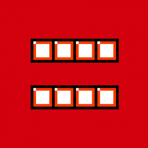
Tetris Equality
Comments Off on Tetris EqualityWhy didn’t I think of this right away?
-
My NaNoWriMo – 30 Covers, 30 Days project: ‘What the Water Gave Me’
Comments Off on My NaNoWriMo – 30 Covers, 30 Days project: ‘What the Water Gave Me’I was asked by the amazing Debbie Millman to participate in 30 Covers, 30 Days, a project in which designers have 24 hours to create a cover for a novel being written as part of National Novel Writing Month (NaNoWriMo).
I was given the synopses of three novels being developed by three different participating authors and chose ‘What the Water Gave Me’ by Charles Heathcote. The synopsis:
Title: What the Water Gave Me
Author name: Charles Heathcote
Author’s region: England
Genre: Literary Fiction
Synopsis:
A novel spanning seventy years, What the Water Gave Me is a reimagining of the Scottish tale: The Selkie Wife. Beginning in the 1940s, our unnamed six year old protagonist discovers a naked woman dancing in a cove – she is Deirdra, a Selkie. From this moment, he is enraptured. They spend the day together, but in the evening, she returns to the sea.Every seven years, Deirdra reappears and he goes to her, although a question hangs over them both: if he took her pelt she would have to stay with him, but will he? Their relationship faces challenges, as the protagonist grows older and Deirdra remains the same age as she was when they first met. This is a novel exploring the complexity of love and man’s morality.
Once the synopsis was selected, I was given a working day to come up with a cover and submit it to the program for inclusion in their blog. This was a bit of a challenge (and I hardly think I’m unique here) mostly because I had client work to do, and the project was due by end of day this past Monday. And I teach all day on Mondays at the CMU School of Design.
I took my inbetween time on Monday to work out a few sketches and choose a concept; when I got home from class I got to work. I decided to work primarily in watercolor pencil because of the time frame. My plan was to sketch out a few different layers and work them together in photoshop: a base “frame” layer, the name of the author, the title of the book, and a rough sketch of a woman based on Venus from ‘The Birth of Venus‘ by Sandro Botticelli.
I had about three hours to sketch, paint, dry, scan, superimpose, tweak and send. Plenty of time. Not a lot, but plenty. Here are some snapshots of the unedited work:

The frame for the book.

The ‘Venus’-inspired sketch.

Another frame idea I didn’t use (too much, too literal, and not enough time for me to make it work), plus the author’s name in the upper left.

A few of the title treatments I explored. I also tried doing a trace of type on watercolor paper. These didn’t work, mostly because I didn’t have time to do it right. I didn’t end up using any of these.
This concept was driven by a few different ideas:
- 7 years is a long time to go between seeing the person you love. It has to be hard. Love must fade during these times.
- Especially time goes on, the difference in age between the human and the Selkie would grow. Eventually he will fade away but she will live on.
- Watercolor (and water) were obvious mediums because of their direct relationship to the ocean but also because water makes things bleed and fade, and it would be easy to build up layers while still keeping this fairly light.
- The concept of fading away was one I decided would drive this idea.
These watercolor sketches were scanned in and superimposed on one another in photoshop.
I decided against using the hand-rendered titles because I couldn’t, in the allotted time, get the desired effect nor could I render the type clearly enough quickly enough. The typeface I used was a heavy weight of Oswald, a Google Web Font created by Vernon Adams which I then blurred manually using the blur tool. As the title goes on, just as time, clarity fades away. I could only imagine the ongoing convolution felt by someone in this situation and it seemed an appropriate title treatment. Yet I still needed to keep it legible, if only even in context.

I had one other thing to address in production: I wanted this to be light but I couldn’t leave the background outside of the frame of the illustration perfectly white because the blog where these items would be posted is stark white. So I picked some colors based on my design and very lightly airbrushed the edges of the cover so it would stand out against a white background (the top two layers shown above).
My thoughts looking back at this: I wish I’d made it a bit more saturated, that I’d had time to do more “takes” of the author name, but overall I’m pretty happy with the results. I might have chosen another typeface given more time but I also wanted to avoid using a geometric face like Gotham because they’re used so much now. I thought it would be interesting to show the process here since I often can’t show what happens behind my work.
I hope the author, Charles Heathcote, is happy with the finished product which you can see here!
-
In response to Paula Scher’s “Unjustified” essay on Imprint
Comments Off on In response to Paula Scher’s “Unjustified” essay on ImprintWhen Paula Scher wrote her piece entitled ‘AIGA: Unjustified — Imprint-The Online Community for Graphic Designers‘, I stumbled upon it immediately and submitted a response on April 3. For some reason that response never moved from moderation to “live” status on their website. At this point, were they to publish it, it would look like I hadn’t been following the conversation. So here’s what I wrote in response.

my comment. still awaiting moderation.
As the outgoing president of the Pittsburgh chapter of AIGA, our regional competition was re-tooled years ago along these lines. Initially renamed “CONTEXT”, the competition asked designers to define the objectives, audience and challenges in creating submitted pieces. We still use these criteria today, even as the competition evolves.
The idea was that the show had grown stagnant, with judges selecting the same kind of work year after year, often seeing the sames firms and clients represented. These works were beautifully designed, of course. Many of them served the purpose the clients requested innovatively and creatively. But there is more to design than beauty. There is also effectiveness. Our chapter’s competition today seeks to recognize work that is “effective, meaningful, and beautiful” because we are convicted that good design can be more than just beautiful.
AIGA, like the design profession, is going through some major changes; as an organization, AIGA is trying many new things in response to feedback we receive from members and non-members alike. I do not speak for AIGA in any official capacity. But I can tell you that from the chapter level up to the national staff and board of directors, the organzation is asking a lot of questions about the future of design and what it means to be a graphic designer in the 21st century. This means trying new things. Sometimes it means letting old things go. But I personally believe that AIGA represents our best opportunity as designers for advocacy and visibility outside of our profession, and that the leadership of AIGA is working hard to ensure the position of our industry well into the future.
Paula, I think the points you raise here are valid and worth discussion; but I also believe AIGA is still committed to showcasing “beauty, creativity, surprise, innovation, and inspiration” in design via Design Envy and through other channels. And I think the comment that “The AIGA membership never believes that their clients respect them” is unfair because many of us – myself included – experience respect, appreciation and admiration every day from our clients. I think the comment is editorially powerful, but if you really believe that, I can point you to throngs of AIGA members I know personally who would disagree. I also take issue with the idea that we, as designers, can learn nothing from the results of this competition. It seems premature to call the contest before we’ve seen its outcome, and I imagine that we’ll be surprised with the number of beautiful, innovative and creative solutions that are selected as part of this show.
The call for AIGA to recognize beauty, creativity, surprise, innovation, and inspiration is critical, and it will continue to be. This shift does not mean a departure from these things, it means that AIGA is looking to show us something different and new, in response to feedback from people like you and others in our community of design. I think it’s fair to say that someone in your position of leadership within design should speak out when they feel that our preeminent professional association is making a mistake; I’m glad that you have and I hope that this esay can be a starting place for dialogue on this matter. I believe that good design takes many forms. And I believe that the history of AIGA competitions was not an exhaustive survey of the state of design, just as this competition will not be. But I also believe that the changes the organization is making come from the right place with an eye on the right future.
If you have thoughts on this topic, head over to imprint to check out the original contribution and add your voice.
-
DesignInquiry board meeting
Comments Off on DesignInquiry board meetingI’m in New York City, in the last day of a three-day board retreat for DesignInquiry, a non-profit design research & thinking organization that stages a series of events each year centered on a design-related topic.

Front door to Anita Cooney's home, hosting the DI board.
I’m heavily involved in helping DesignInquiry integrate its public website, the DesignInquiry journal website, and archives from as far back as 2004. In addition, we’ve been working on figuring out our board structure and exploring the future of the organization.
It’s crazy to think about the course DesignInquiry has taken over the past couple of years. I joined the board in 2007, having attended in 2005 and 2006. The organization grew out of the Maine Summer Institute of Graphic Design; in 2005, DesignInquiry was like a miniature grad school with “faculty” including Elliott Earls, Doug Scott, Marlene McCarty, Rick Valicenti and others.
The experience at the time was so amazing for me that I described to friends my emergence on the other side of DesignInquiry as awakening from a “design depression” – something I didn’t even know I was experiencing. It changed the way I thought about design. And in subsequent years, as the structure changed to flat heirarchy, it not only helped me to remember that my particular voice was valuable in design but that intimate collaboration with others can be transformative in the way we think about design and life.
Years later I still benefit from that first DesignInquiry. I believe so much in the work the organization does as it has focused its purpose on creating and disseminating design thought. We have a lot of work to do to figure out where this is going long term, and it’s exciting to be involved.
-
At long last, a new website
Comments Off on At long last, a new websiteThe cobbler’s children have had no shoes long enough. This is my new website.
An improvement, yes?
-
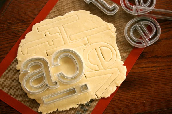
Helvetica cookie cutters by Beverly Hsu
Comments Off on Helvetica cookie cutters by Beverly Hsu
Beveryl Hsu was an intern of mine over the summer of 2008 and graduated from CMU in 2009.
About a year ago she created some Helvetica cookie cutters which are all over the design blogs right now.
Congrats, Beverly, on the coverage! Now get those cookie cutters into production and make some, uh, dough, while the getting’s good.
You can see Beverly’s Helvetica cookie cutters here.
-
‘What Matters Now’ by Seth Godin
Comments Off on ‘What Matters Now’ by Seth Godin‘What Matters Now’ is a new ebook organized by Seth Godin and contains ideas from a bunch of authors/thinkers about what needs to happen in the world: to change the way we think and act; to be productive and positive, open and sharing.
I downloaded the PDF this morning and it’s a worthy read. Get it here.
-
Packaging Design annoyances
Comments Off on Packaging Design annoyancesJust a few thoughts:
- Laminating paper makes it hard (and by hard I mean impossible, because who is going to have the time to peel laminate from chipboard) to recycle.
- Why would a non-recyclable plastic or plastic without a recyclable content indicator be used when recyclable content plastic is no more expensive?
- Did you really choose foamcore as part of your packaging plan?
- Have you considered the environmental implication of every single piece of packaging involved in your custom mold-injected plastic and polystyrene clamshell?
A few weeks ago a bought a candle at Target and was disappointed that the box the candle came in, though about 99% paper, had some kind of plastic – something like transparent tape – holding together the corners. The problem was that this was inside the layers of paper used to build the box, so it wasn’t on the surface and could not be easily removed.
This leaves the consumer with few options: do they recycle the paper & chipboard with the plastic in place, do they throw out the box? For me, it makes me wonder about the choices that were made in creating this box. Did Target even know this was involved in the production of the box? Did they spec it?
I feel constant disappointment with big business that make bad decisions in these respects. I feel like “being green” is commonplace enough that I would expect businesses like Target and others that are progressive with respect to other social issues to be progressive on the environmental front.
What also annoys me is that I thought I was buying a item packaged in a 100% paper carton. I’m not sure if this is a case of “fool me once, shame on you” or “fool me twice, shame on me”. Either way, it serves as a reminder that a little skepticism or cynicism may have prevented this experience.