My NaNoWriMo – 30 Covers, 30 Days project: ‘What the Water Gave Me’
I was asked by the amazing Debbie Millman to participate in 30 Covers, 30 Days, a project in which designers have 24 hours to create a cover for a novel being written as part of National Novel Writing Month (NaNoWriMo).
I was given the synopses of three novels being developed by three different participating authors and chose ‘What the Water Gave Me’ by Charles Heathcote. The synopsis:
Title: What the Water Gave Me
Author name: Charles Heathcote
Author’s region: England
Genre: Literary Fiction
Synopsis:
A novel spanning seventy years, What the Water Gave Me is a reimagining of the Scottish tale: The Selkie Wife. Beginning in the 1940s, our unnamed six year old protagonist discovers a naked woman dancing in a cove – she is Deirdra, a Selkie. From this moment, he is enraptured. They spend the day together, but in the evening, she returns to the sea.
Every seven years, Deirdra reappears and he goes to her, although a question hangs over them both: if he took her pelt she would have to stay with him, but will he? Their relationship faces challenges, as the protagonist grows older and Deirdra remains the same age as she was when they first met. This is a novel exploring the complexity of love and man’s morality.
Once the synopsis was selected, I was given a working day to come up with a cover and submit it to the program for inclusion in their blog. This was a bit of a challenge (and I hardly think I’m unique here) mostly because I had client work to do, and the project was due by end of day this past Monday. And I teach all day on Mondays at the CMU School of Design.
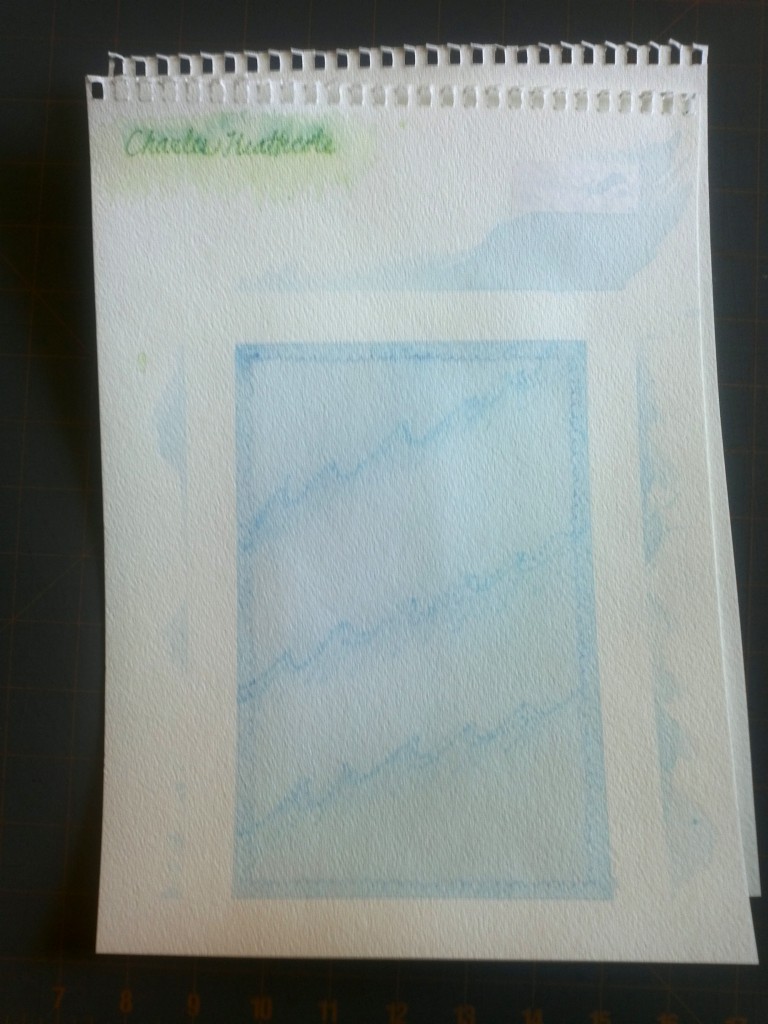
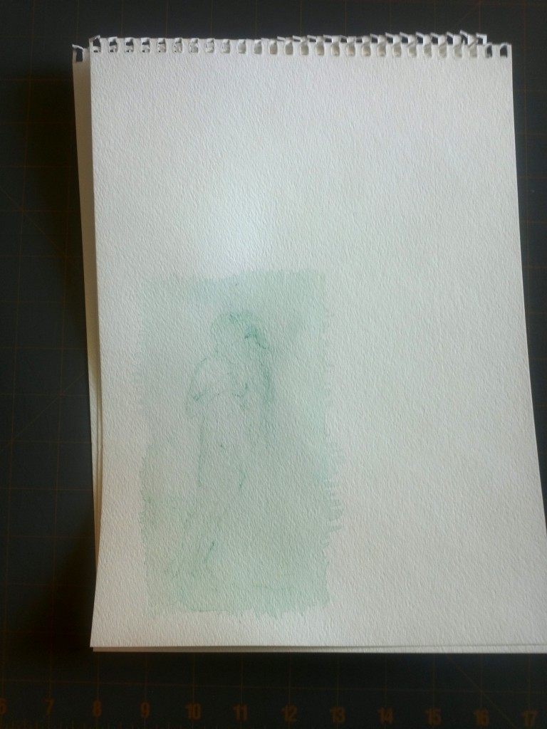
I took my inbetween time on Monday to work out a few sketches and choose a concept; when I got home from class I got to work. I decided to work primarily in watercolor pencil because of the time frame. My plan was to sketch out a few different layers and work them together in photoshop: a base “frame” layer, the name of the author, the title of the book, and a rough sketch of a woman based on Venus from ‘The Birth of Venus‘ by Sandro Botticelli.
I had about three hours to sketch, paint, dry, scan, superimpose, tweak and send. Plenty of time. Not a lot, but plenty. Here are some snapshots of the unedited work:

Another frame idea I didn’t use (too much, too literal, and not enough time for me to make it work), plus the author’s name in the upper left.

A few of the title treatments I explored. I also tried doing a trace of type on watercolor paper. These didn’t work, mostly because I didn’t have time to do it right. I didn’t end up using any of these.
This concept was driven by a few different ideas:
- 7 years is a long time to go between seeing the person you love. It has to be hard. Love must fade during these times.
- Especially time goes on, the difference in age between the human and the Selkie would grow. Eventually he will fade away but she will live on.
- Watercolor (and water) were obvious mediums because of their direct relationship to the ocean but also because water makes things bleed and fade, and it would be easy to build up layers while still keeping this fairly light.
- The concept of fading away was one I decided would drive this idea.
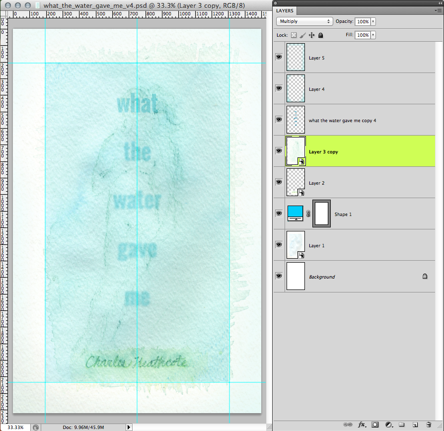
These watercolor sketches were scanned in and superimposed on one another in photoshop.
I decided against using the hand-rendered titles because I couldn’t, in the allotted time, get the desired effect nor could I render the type clearly enough quickly enough. The typeface I used was a heavy weight of Oswald, a Google Web Font created by Vernon Adams which I then blurred manually using the blur tool. As the title goes on, just as time, clarity fades away. I could only imagine the ongoing convolution felt by someone in this situation and it seemed an appropriate title treatment. Yet I still needed to keep it legible, if only even in context.
I had one other thing to address in production: I wanted this to be light but I couldn’t leave the background outside of the frame of the illustration perfectly white because the blog where these items would be posted is stark white. So I picked some colors based on my design and very lightly airbrushed the edges of the cover so it would stand out against a white background (the top two layers shown above).
My thoughts looking back at this: I wish I’d made it a bit more saturated, that I’d had time to do more “takes” of the author name, but overall I’m pretty happy with the results. I might have chosen another typeface given more time but I also wanted to avoid using a geometric face like Gotham because they’re used so much now. I thought it would be interesting to show the process here since I often can’t show what happens behind my work.
I hope the author, Charles Heathcote, is happy with the finished product which you can see here!


Comments are closed